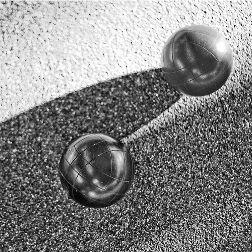
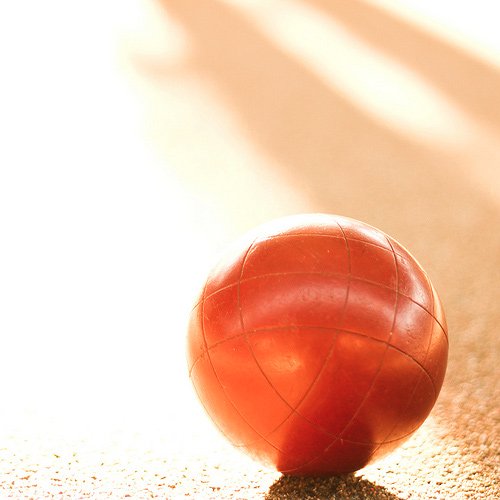
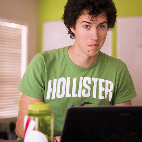
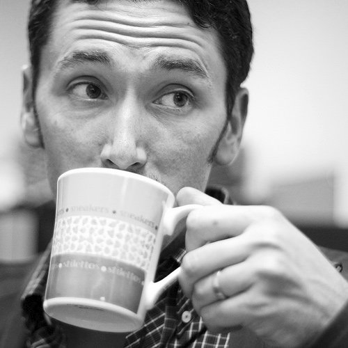
Polaroids with CSS3
In this playground adventure, we use some awesome CSS2 and CSS3 to turn an otherwise unassuming list of images into a full-blown set of polaroid pictures. Check out the demo and code snippets below. Read the blog post for more info »
Note: Demo works best in Safari 4.x and Chrome 5. In Firefox you won't see the enlarging transition.


How it Works
Through a combination of browser-specific CSS (2 and 3) integration and some basic styling, we've turned regular old images into cool looking polaroid style images—with no additional markup to show the text.
Using the Title Attribute
Instead of adding additional markup (more headings or paragraphs), we've opted to reuse the content within the title attribute of the surrounding anchor tag. Since it's good practice to use proper title text, and it's really freaking cool to do stuff with just CSS.
ul.polaroids a:after {
  content: attr(title);
}
Note: this is from the CSS2.1 spec, but browsers haven't implemented it fully. Read up on it here. It does, however, work in IE8, FF2+, Safari 3+, Opera, and Chrome)
We have to use the title attribute for the anchor because the alt attribute isn't fully implemented by Safari or Firefox. This would work in the same way with an img tag once that is integrated.
Adding "Random" Tilts
Safari 4 and Firefox 3.5 both have support for the :nth-child pseudo-selector (this is CSS3). With it, you can programatically select sibling elements that are even, odd, and much more. In this example, we use several options that help give the images a more random looking layout.
/* By default, we tilt all our images -2 degrees */
ul.polaroids a {
  -webkit-transform: rotate(-2deg);
  -moz-transform: rotate(-2deg);
}

/* Rotate all even images 2 degrees */
ul.polaroids li:nth-child(even) a {
  -webkit-transform: rotate(2deg);
  -moz-transform: rotate(2deg);
}

/* Don't rotate every third image, but offset its position */
ul.polaroids li:nth-child(3n) a {
  -webkit-transform: none;
  -moz-transform: none;
  position: relative;
  top: -5px;
}

/* Rotate every fifth image by 5 degrees and offset it */
ul.polaroids li:nth-child(5n) a {
  -webkit-transform: rotate(5deg);
  -moz-transform: rotate(5deg);
  position: relative;
  right: 5px;
}

/* Keep default rotate for every eighth, but offset it */
ul.polaroids li:nth-child(8n) a {
  position: relative;
  top: 8px;
  right: 5px;
}

/* Keep default rotate for every eleventh, but offset it */
ul.polaroids li:nth-child(11n) a {
  position: relative;
  top: 3px;
  left: -5px;
}
Read about :nth-child and it's usage here.
Although this seems like a bit much, this works to our advantage. First, we don't need any additional classes because we can select which ones we want via the :nth-child pseudo-selector. Second, by having so many changes, we get the random appearance in a decent sized gallery.
Making Them Scale
For the scaling, we once again turn to some CSS3. The transform properties we used above can be used to scale our images as well (this if the for hover effect) for a nice hover effect.
/* Scale the images on hover, add transitions for smoothing things out, and ensure the hover appears on top */
ul.polaroids a:hover {
  -webkit-transform: scale(1.25);
  -moz-transform: scale(1.25);
  position: relative;
  z-index: 5;
}
Sweet, now we have our "randomly" rotating images, title text for captions, and some cool hovers to zoom in on the image.
Final Details
Now, we go back and make things as sexy as can be with some more CSS3 goodness. In addition, since Safari supports transitions (they're in the works for Firefox), we can smooth the hover effect by adding just one extra rule.
/* Add drop shadows and smooth out the transition (Safari only) */
ul.polaroids a {
  -webkit-transition: -webkit-transform .15s linear;
  -webkit-box-shadow: 0 3px 6px rgba(0,0,0,.25);
  -moz-box-shadow: 0 3px 6px rgba(0,0,0,.25);
}

/* On hover, darken the shadows a bit */
ul.polaroids a {
  -webkit-box-shadow: 0 3px 6px rgba(0,0,0,.5);
  -moz-box-shadow: 0 3px 6px rgba(0,0,0,.5);
}
And with those finer details added, we've created some freaking sweet polaroid style images with nothing more than a list of images and some fancy CSS.
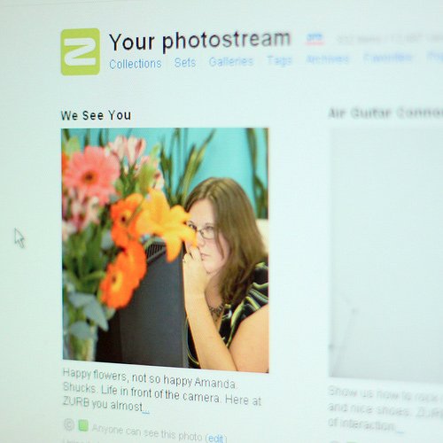
Like what you see here?
Sweet, so do we! You can easily create a messier overlay style by changing the margins on your polaroids like we have here. The effects all hold up, but the stack of images looks much more organic.
Score an awesome product engineering or design job
Copyright ZURB, freely available for distribution under the MIT license.
Check out other Playground experiments
Foundation CSS Grid Examples
Foundation CSS Grid + Container Queries
Foundation Grids within Grids

Reactive Animation Listener
